Saporito means “Tasty” in Italian, but for a group of dreamers, entrepreneurs, visionaries and “foodies”, Saporito! means an opportunity to dedicate their lives to their true passion: cooking and delighting people’s palates.
Italian food is undoubtedly one of the most versatile foods in the world. For this reason (and the fact that it is very tasty) the Italian cuisine sector is a segment that has undergone great changes, becoming very saturated, competitive and becoming a large and complex market. Especially for new and small brands.
Our challenge was to create a strong and original brand, keeping the essence of a “small brand without pretensions” but with the height of a big brand, able to compete with the rest of the market offer and at the same time creating an attractive story.
What we did
For the project we dug deep to find the roots of Italian culture and researched the most characteristic and traditional features to fill them with contemporaneity and modernism. In a work of co-creation we realized that the attitude of Italian cuisine and that of the Saporito team were the same and undoubtedly the starting point: impetus, uniqueness, character, nostalgia, simplicity and warmth, are some of the attributes that derive completely in the brand.
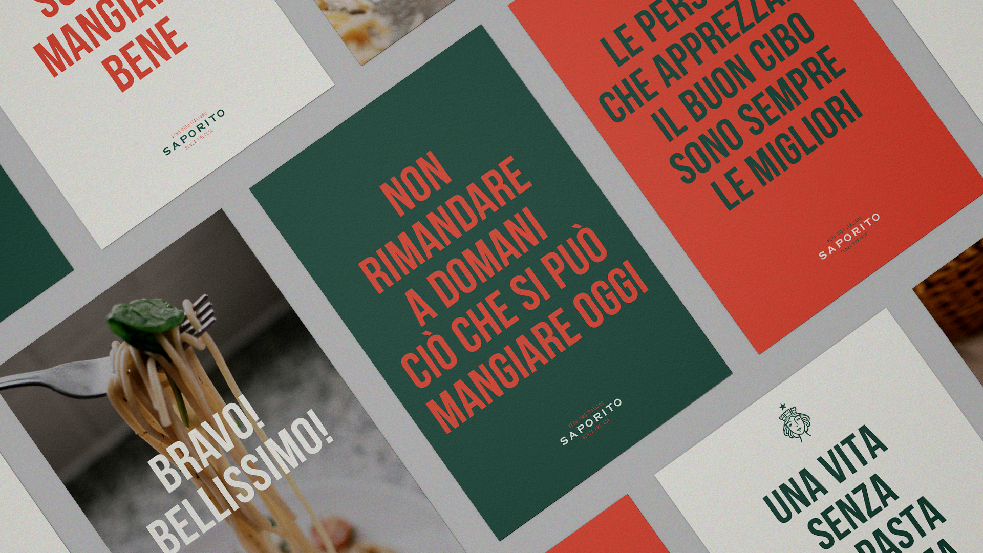
Based on this spirit, we built a brand strategy that would serve as a compass for Saporito to “feed” not only the diners but also the brand and its culture. “Vero cibo Italiano. Senza Pretese” (Real Italian food. No pretensions) sums up that totally unique personality of the brand. It’s about doing things right, giving its best to “nourish life and nourish the soul”, it’s about “living intensely every spoonful of salt, every tomato and every gram of flour used to create a simply unique experience”.
Feeding the roots of the simplicity
Noduz developed a brand identity based on two strong characteristics of the brand and Italian gastronomy: Versatility and simplicity. These codes have been our reference and we have paid attention and sought to understand in depth this essence to express its personality in every product and touch point.
The visual identity had to be up to the task. It had to reflect and personify the great product that comes out of its kitchens and the soul of Italian cuisine and its founders.
Italy is rich in symbolism. There are three main official symbols of Italy: the flag, the national emblem and ‘Il Canto degli Italiani’ (“The Song of the Italians”, Italy’s national anthem). And there are also other official symbols such as the Presidential Standard (representing the Presidency of the Republic of Italy), the ‘Altare della Patria’ (national document dedicated to King Vittorio Emanuele II of Savoy) and ‘La Festa della Repubblica’ (national day celebrating the birth of the Italian Republic).
But the symbols of Italy are not only those with which it is officially identified. There are other symbols that uniquely represent its history, its culture, its feelings. And that personify through metaphors and allegories the feeling and heritage of the entire Italian people.
Previous
Next
It is for this reason that we were inspired by an important symbol of Italian culture: the ‘Italia Turrita’.
The ‘Italia Turrita’ is the national personification of Italy, whose main feature is a wall crown (hence the name ‘turrita’ or “with towers” in Italian) typical of Italian civic heraldry of communal origin.
‘Italia Turrita’ is a woman with typically Mediterranean attributes featuring a smiling face, dark hair and an elegant, idealized beauty. Above her head, the ‘Stella d’Italia’ a radiant five-pointed star, which represents the “brilliant destiny of Italy” and is an icon of the Unification of Italy and a fundamental element of the current coat of arms of Italy approved at the birth of the Italian Republic in 1948.
This symbol, this woman, for Saporito is the cornerstone and protagonist of the identity. A symbol that embodies quality, the heritage of Italian cuisine and the soul and essence of its founders.
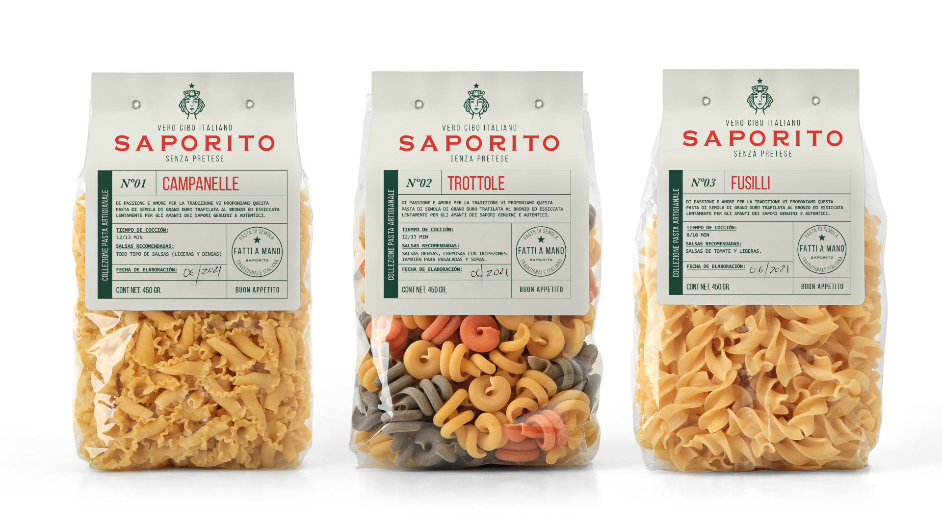
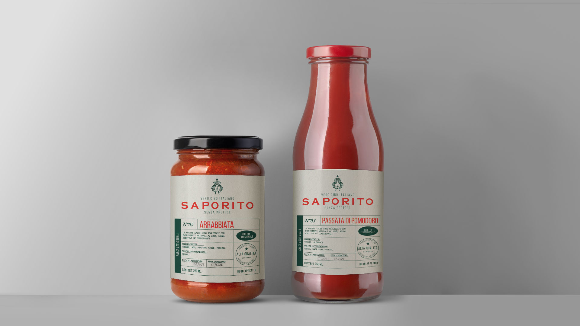
The colors: red, green and “white” of the Italian flag, but with slight changes in their shades to give them a unique, different and functional touch. And the use of classic typographies that together denote that classic Italian elegance.
Previous
Next
A brand full of symbolism, full of characteristic ingredients but with subtle twists that give us a high level brand, of quality, simple and versatile. A tasty brand, very "Saporito".